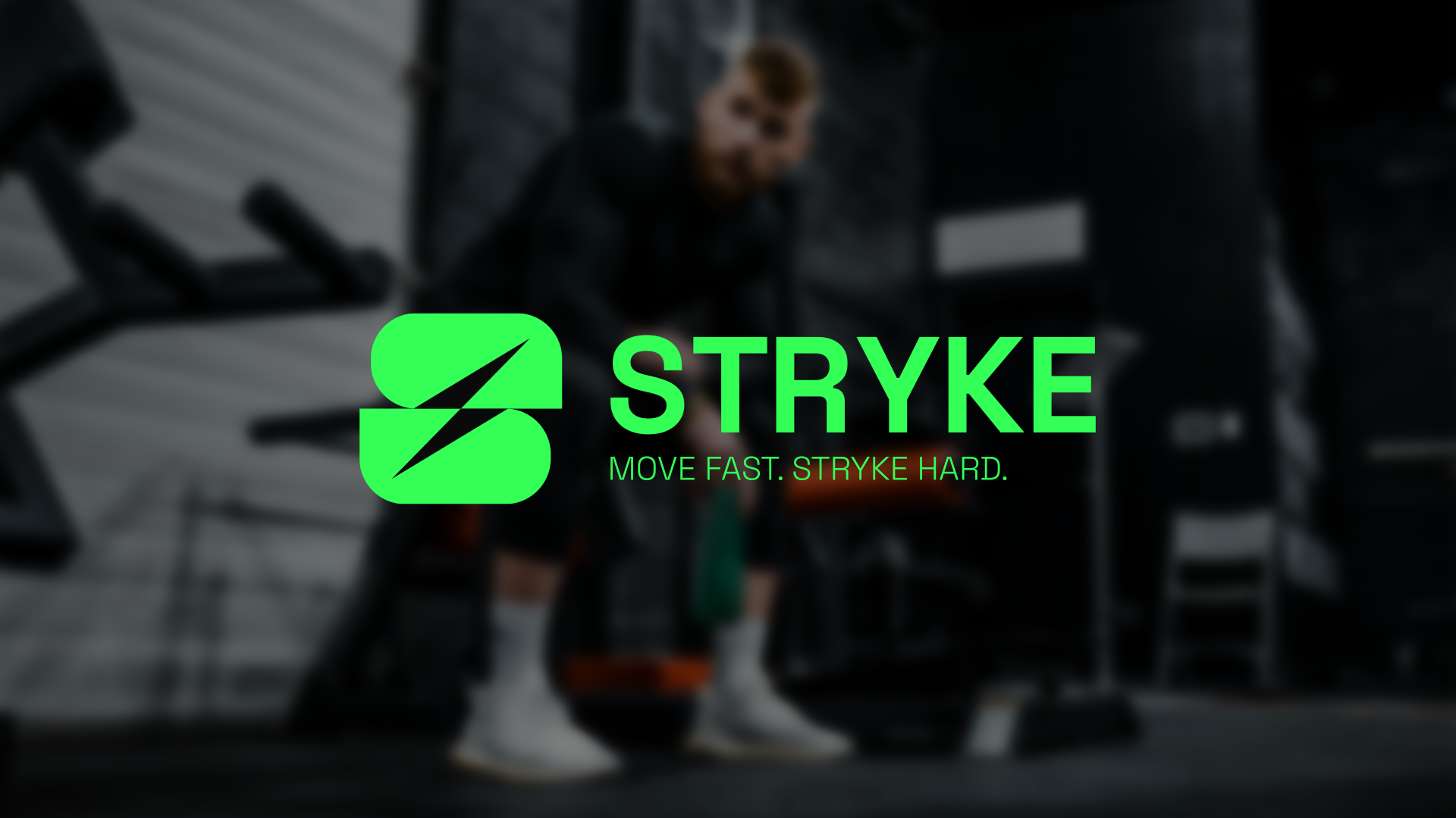
STRYKE
Logo Design & Visual Identity // 2025
ABOUT THE COMPANY
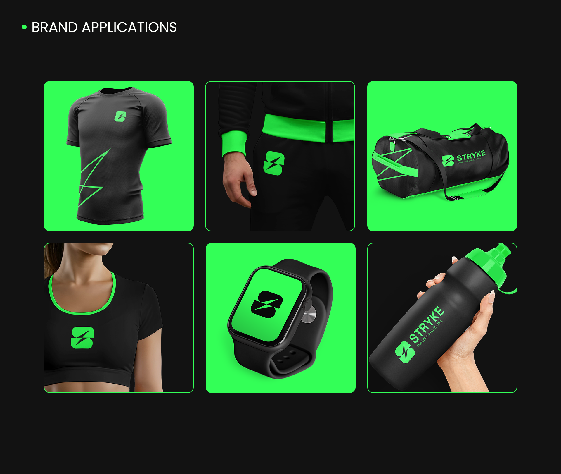
STRYKE is a sports and lifestyle brand that combines innovative materials, functional design, and modern aesthetics. The brand is aimed at people who seek maximum comfort, high performance, and minimalist style. STRYKE is not just a sports brand – it's a way of life, inspired by the dynamics of the modern city and technological progress.
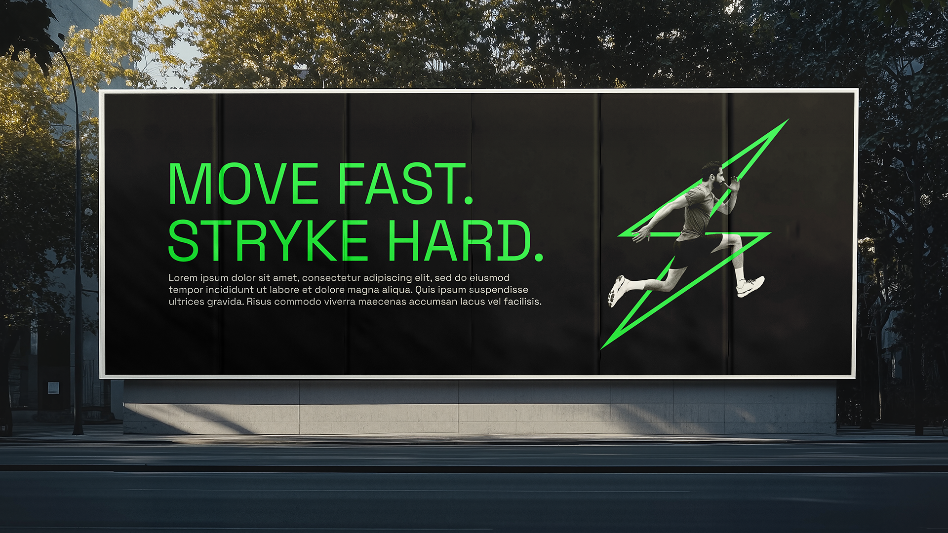
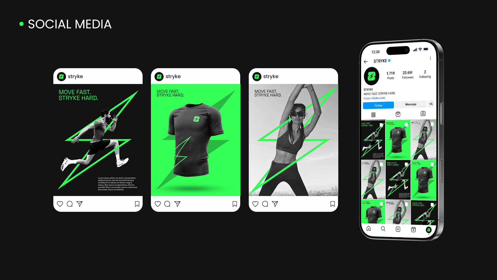
The brand’s core idea is to deliver “Move Fast. Stryke Hard.” – apparel that is functional, comfortable, and stylish, without compromising on quality.
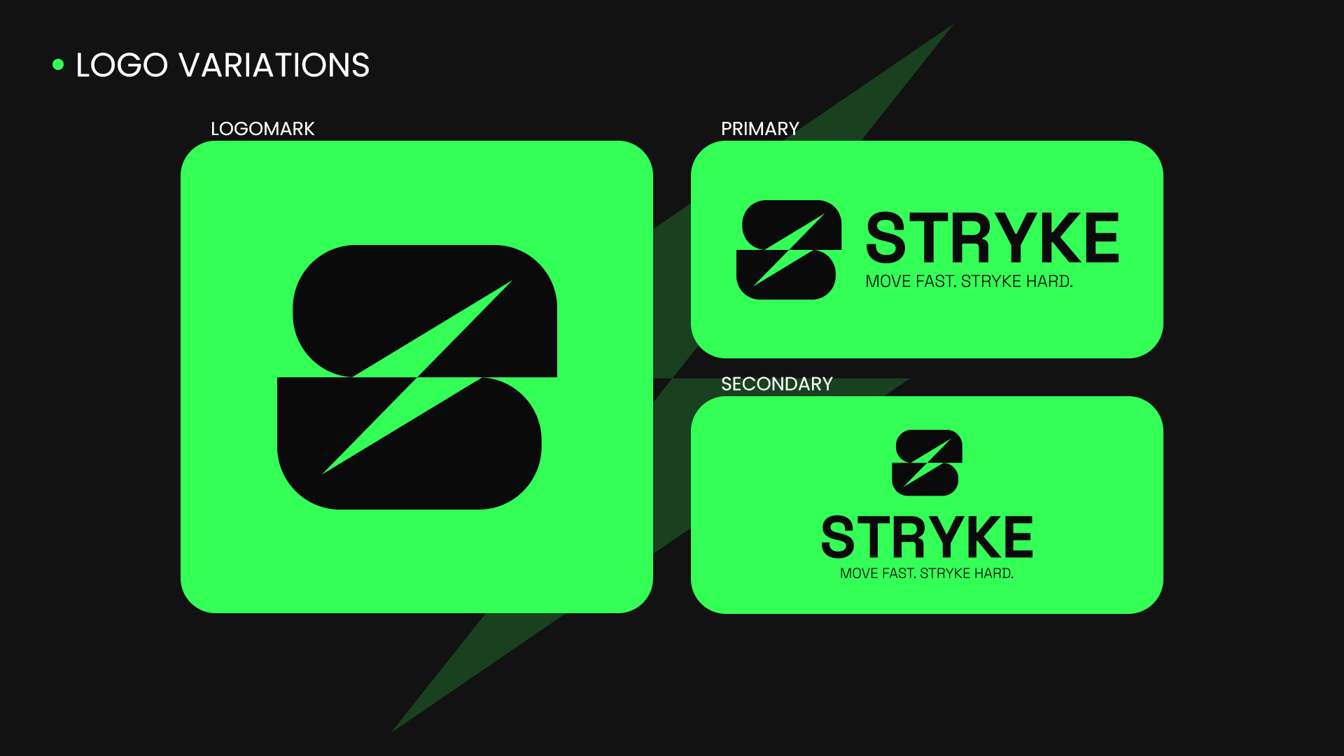
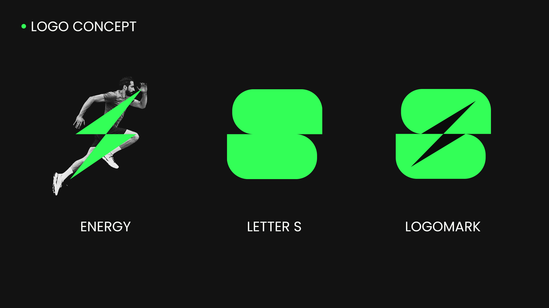
LOGO CONCEPT
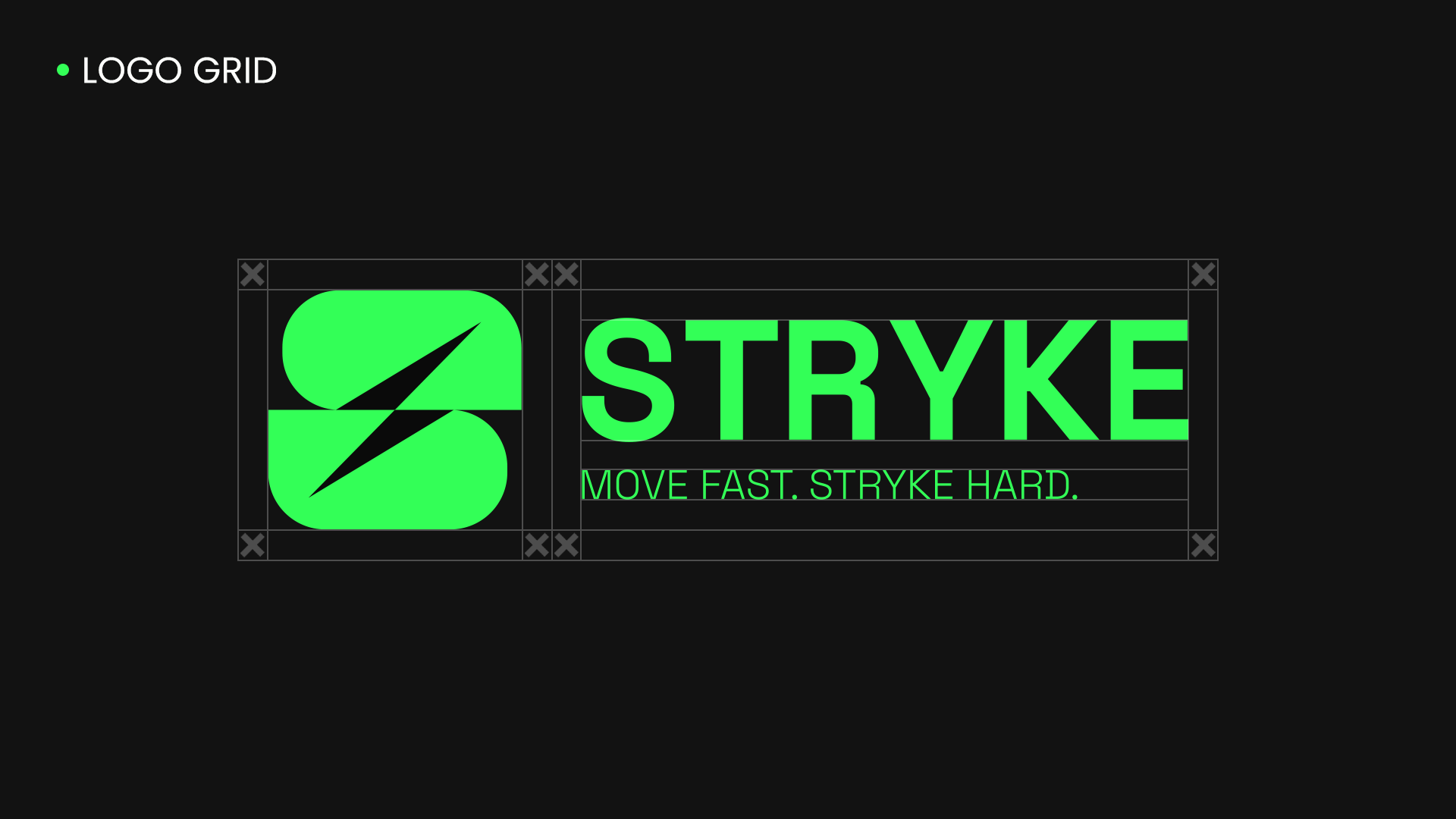
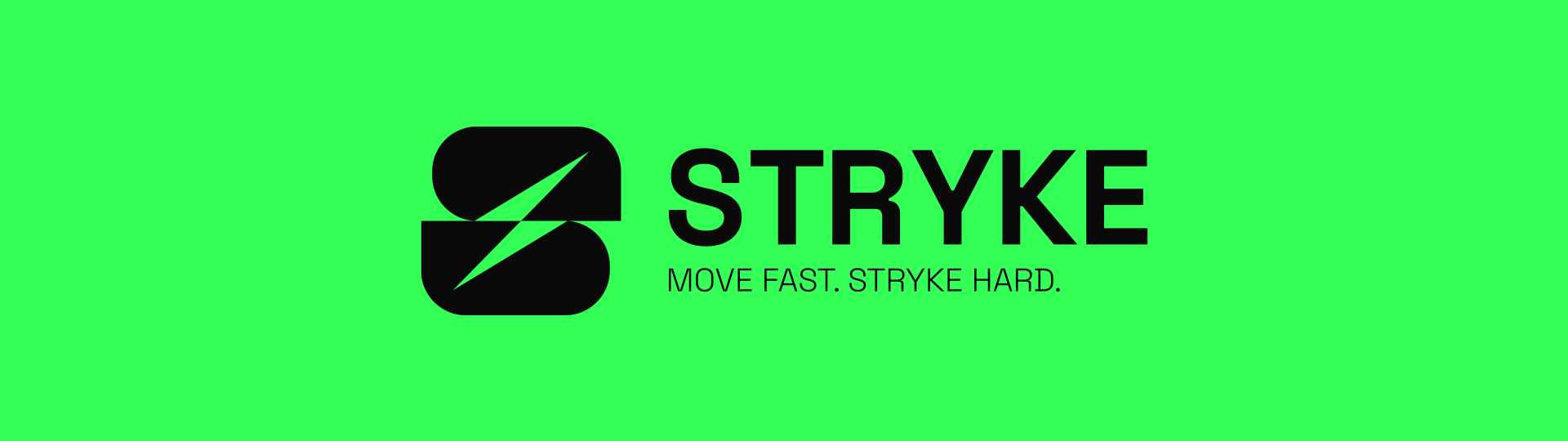
STRYKE is a modern fitness brand aimed at people with an active lifestyle. The name comes from the word "strike", symbolizing strength, speed, and impact. The concept is built around the motto "Move fast. Stryke hard.", combining the energy of movement with the power of motivation.
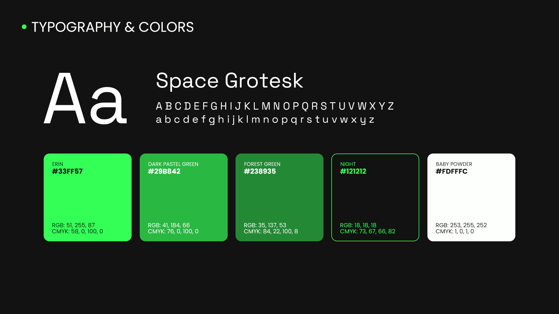
TYPOGRAPHY & COLOR PALETTE
The visual identity of STRYKE is built around a carefully selected color palette and typography that enhance the feeling of energy, technology, and modern urban style.
A neon green color is chosen as the main accent, evoking associations with high energy, dynamism, speed, and activity. It is a color that not only grabs attention but also reinforces the sense of high performance and intensity—key characteristics of the brand. Combined with black and white, a strong visual contrast is created, giving the brand a technological and futuristic aura, suitable for both digital environments and physical products.
For typography, the Space Grotesk font is used, which is geometric, clear, and modern, with a strong industrial presence. Its forms blend minimalism and character, providing the brand with technical precision and a sense of forward movement. This makes the typography not only readable but also an ideal complement to STRYKE’s dynamic identity.
THANK YOU!
Would you like to work with me to create or renew your entire brand?
I'm available for new projects, write me here:
Check out more at: